CLOSE
Tolethorpe
Play Video
See the work

To Reimagine Tolethorpe, or Not to Reimagine Tolethorpe: That was the Question
Developing a new brand for Tolethorpe, the historic home of the Stamford Shakespeare Company (SSC), and design a new website with the capability of managing ticket sales fully in-house.
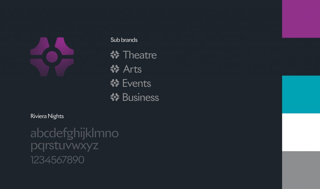
Introducing a younger audience
Our goal was to create a brand that resonates with a modern-day audience while maintaining the essence of Tolethorpe’s core values and rich heritage. Additionally, we aimed to develop a website that is easy to navigate and can handle ticket sales efficiently, streamlining the booking process for customers.
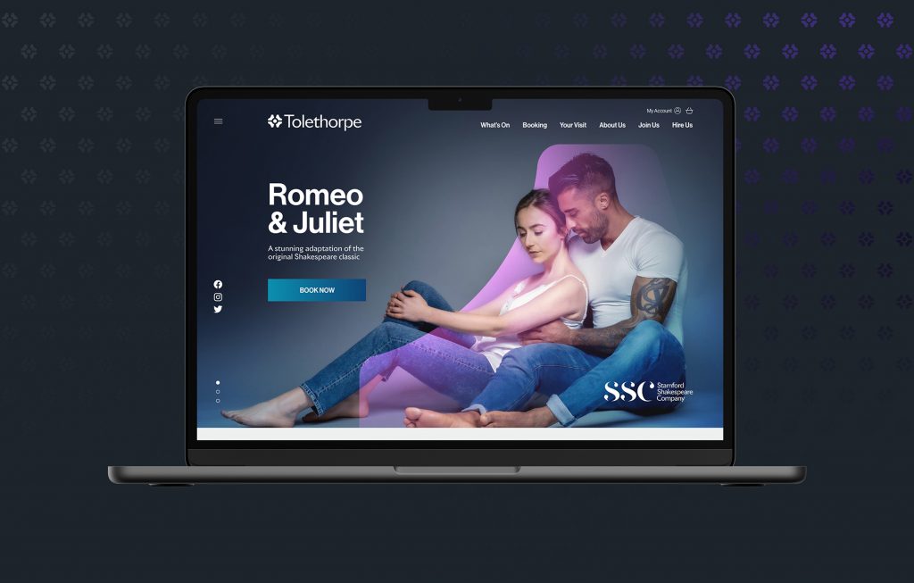
A site designed to be clean and simple, with easy navigation and a better user experience
As part of the brand development, a new website was designed and built, featuring a custom booking system integrated with Spektrix. The site is designed to be clean and simple, with easy navigation and a better user experience that provides visitors with clear information about the venue.
Brand Perception
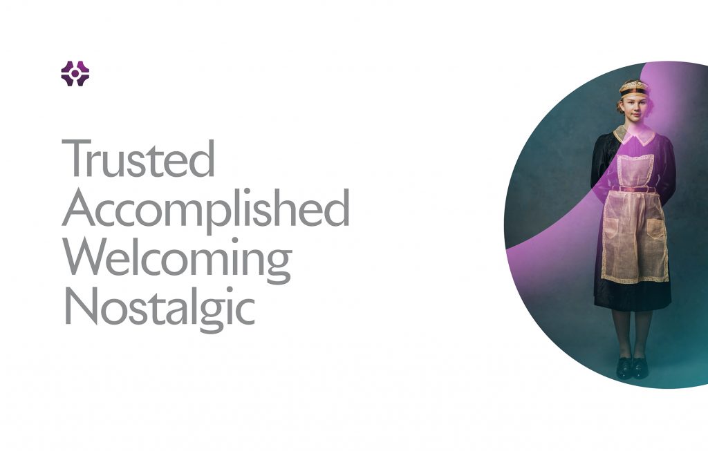
Insight and key findings
Part of the initial work included market research, finding out what local people thought of Stamford Shakespeare Company. This provided some very interesting insights and helped refine the brief for the work ahead.

A hidden gem that could be brought to the forefront
We embarked on an extensive exploration of Tolethorpe’s grounds and buildings to find a hidden gem that could be brought to the forefront of the brand’s visual identity. There we discovered the beautiful hedgerows, or ‘parterre’, which were centrally placed but not entirely obvious from ground level.
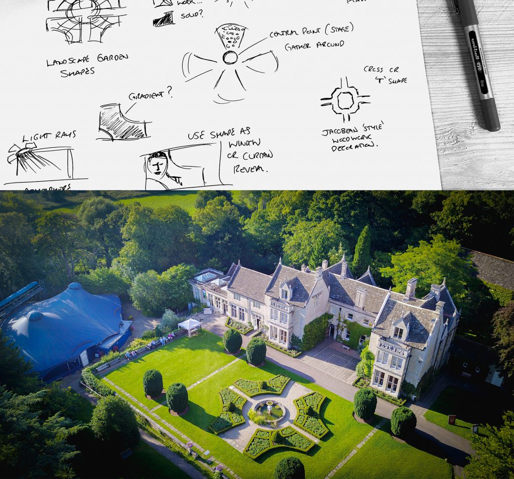
The Parterre
The parterre had been a part of the grounds for many years and was already close to the hearts of the staff and customers. It felt right to give something familiar the centre stage and to make it a symbol of the new Tolethorpe brand.
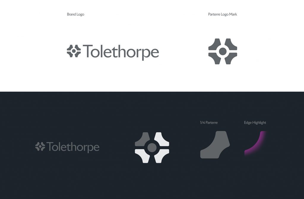
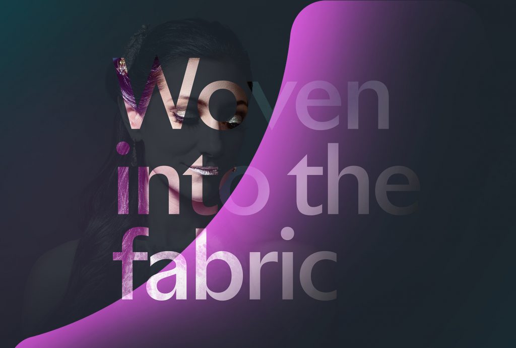
Becoming part of the fabric of Tolethorpe
A graphic that could stand alone as an identifier
We experimented with the shapes and lines of the parterre until we found the perfect balance. We wanted to create a graphic that could stand alone as an identifier, be incorporated into imagery or used as a graphic device. It was important that this graphic became part of the fabric of Tolethorpe and was recognisable as the brand as a whole.
A fitting representation of the venue’s beauty and elegance
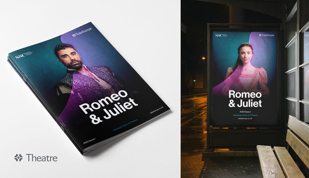
Colours chosen based on their dramatic qualities and illumination
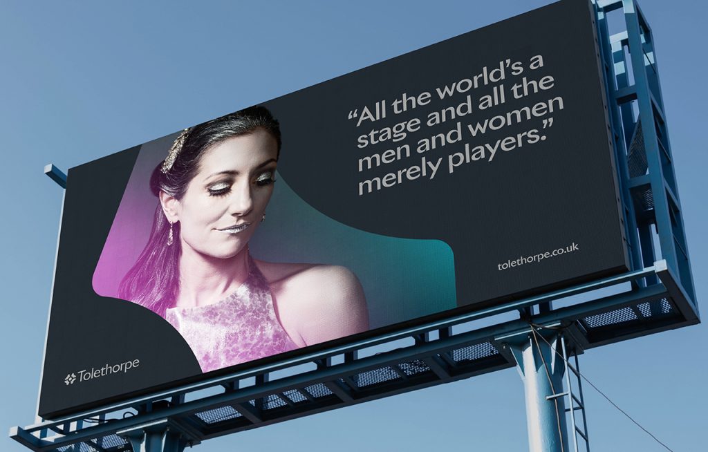
Colours were chosen based on their dramatic qualities and illumination. Inspiration was taken from stage lighting to give atmosphere and sharp contrast to compositions, shedding ‘new light’ on the various new aspects Tolethorpe is to offer while acknowledging its origins on stage.

Inspiration taken from stage lighting to give atmosphere and sharp contrast
Elevating and enhancing Tolethorpe’s existing offerings
Working closely with key stakeholders, we set about creating a brand that would elevate and enhance Tolethorpe’s existing offerings while establishing it as a destination for arts and culture. Market research provided valuable insights into local perceptions of the venue, helping to refine the brief and guide the design process.


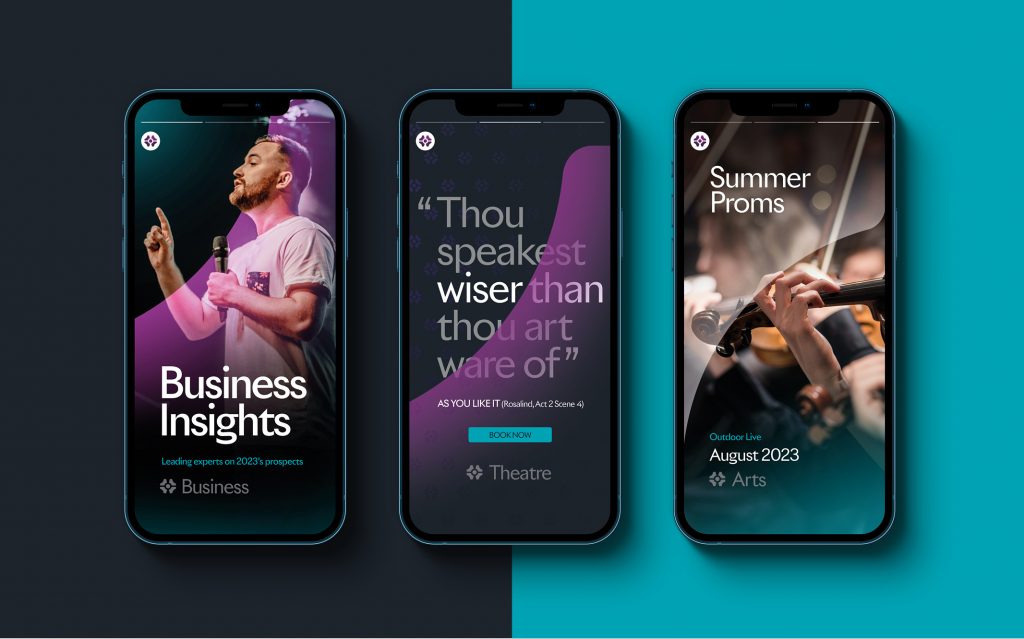
Opening up to weddings, music events, cinema, business and talks
With the new Tolethorpe brand and website in place, the venue is successfully positioned as a destination for arts and culture, offering open-air theatre but also opening up their business to weddings, music events, cinema, business functions, and talks. The parterre graphic serves as a fitting representation of the venue’s beauty and elegance, while the new brand and website provides a seamless experience for visitors, making Tolethorpe an ideal destination for all.

Successfully positioned as a destination for arts and culture

Inspired by Tolethorpe’s transformation?
Let’s discuss how we can help elevate your brand. Contact us today!
WORK
Ready to work with us?
Let's talk. We want to hear about your latest projects and passions.
Join our mailing list!
Get regular updates from the hue fam straight to your inbox.